
When it comes to designing modern, responsive web layouts, Flexbox (Flexible Box Layout) is an essential tool in every web developer's toolkit. Since its introduction, Flexbox has revolutionized how we structure and align content, making previously complex tasks significantly more straightforward. In this blog, we'll dive deep into what Flexbox is, its features, and how you can leverage it to create flexible, efficient, and responsive web designs.
Flexbox, or Flexible Box Layout, is a CSS3 layout module designed to provide a more efficient way to lay out, align, and distribute space among items within a container, even when their sizes are unknown or dynamic. It is particularly useful for creating complex layouts that need to be responsive to different screen sizes.
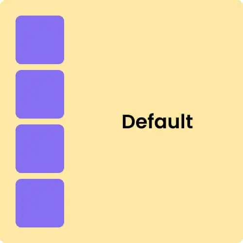
By default, when we have a container with 4 child items, they are displayed
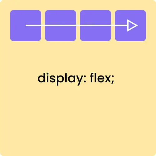
one below the other because a `div` is a block-level element. By using `display: flex;`,
we enable the flex context for all its direct children. Note that CSS columns do
not have any effect on a flex container. Below, I have added examples for
Flexbox. You can check these examples for a complete understanding.
HTML
<
div
class
=
"
container
"
>
<
div
class
=
"
item item1
"
>
Item 1
<
/
div
>
<
div
class
=
"
item item2
"
>
Item 2
<
/
div
>
<
div
class
=
"
item item3
"
>
Item 3
<
/
div
>
<
div
class
=
"
item item4
"
>
Item 4
<
/
div
>
<
/
div
>
CSS
.container
{
display
:
flex
;
/ or inline-flex /
}
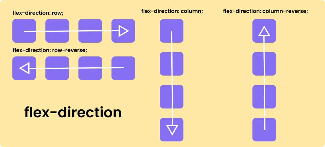
The function of flex-direction in CSS is to tell child elements in which direction
they will be positioned or oriented. Direction means either they will be in a row or
they will be in a column format and they can also be column reverse and row reverse.
We have four settings with flex direction. The flex-direction property in CSS has a
default value is row. This means that, by default, items in a flex container are
arranged in a horizontal line from left to right. Below, I have added examples for
flex-direction. You can check these examples for a complete understanding.
CSS
.container
{
flex-direction
:
row | row-reverse | column | column-reverse
;
}
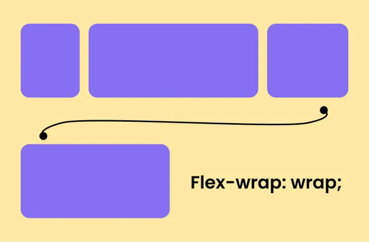
The flex-wrap property in CSS decides if child items should
fit in a single line or wrap to the next line within the main container.
For example, if we have four items with widths of 20%, 50%, 30%, and 30%, they total 130%.
Since this exceeds 100%, some items will wrap to the next line. This wrapping behavior is
controlled by the flex-wrap property.
Below, I have added examples for flex-wrap. You can check these examples
for a complete understanding.
CSS
.container
{
flex-wrap
:
nowrap | wrap | wrap-reverse
;
}
The flex-flow property in CSS is a shorthand for the
flex-direction and flex-wrap properties.
By using flex-flow, you can define both properties in
a single line. This property controls the direction and wrapping
of items within the container. The default value of flex-flow is
row nowrap.
CSS
.container
{
flex-flow
:
column wrap
;
}
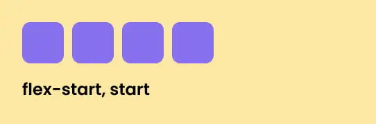
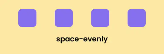
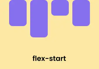
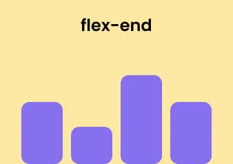
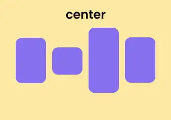
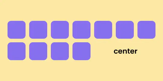
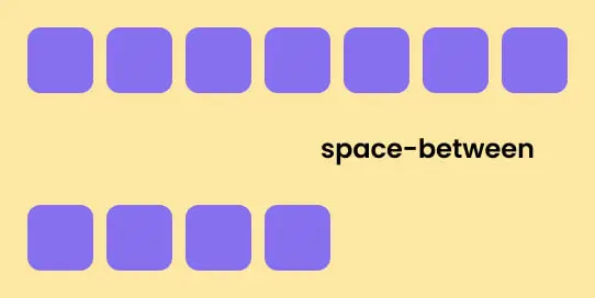
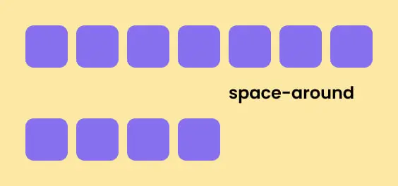
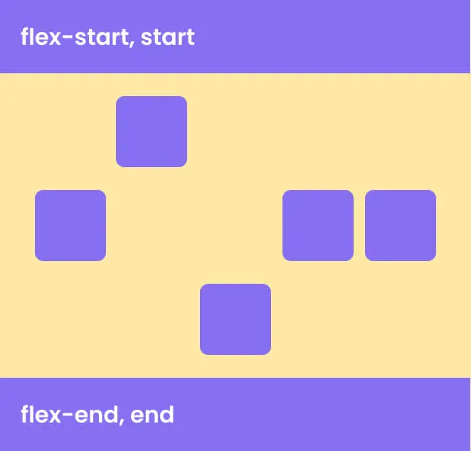
The justify-content property in CSS flexbox controls the alignment
of flex items along the main axis (horizontal or vertical, depending on the
flex-direction) within a flex container. It defines how the extra
space is distributed among the flex items. It determines if items start from the beginning,
end, or center of the container. This property helps arrange and space out items
inside a flex container. Here are the possible values:
CSS
.container
{
justify-content
:
flex-start | flex-end | center | space-between | space-around | space-evenly | start | end
;
}
flex-start (default): Items are grouped at the start of the main axis.
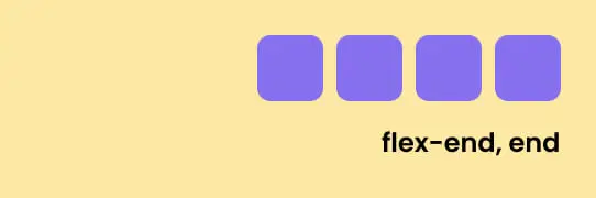
flex-end: Items are grouped at the end of the main axis.
center: Items are centered along the main axis.

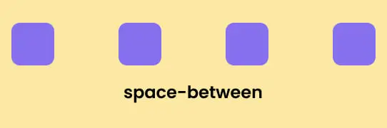
space-between: Items are spaced evenly, with the first item at the start and the last item at the end.
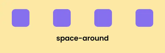
space-around: Items have equal space around them, with half the space at the edges.
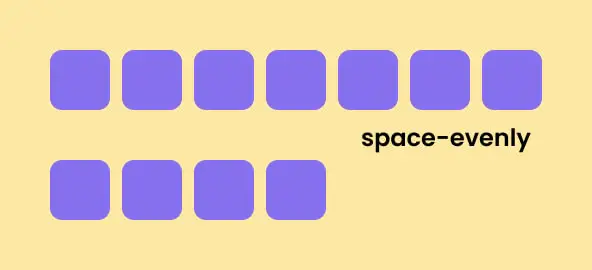
space-evenly: Items are spaced evenly, with equal space around all items, including the edges.
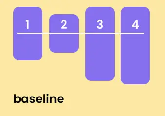
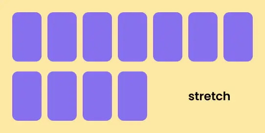
The align-items property in CSS flexbox arranges flex
items along the cross axis, which runs perpendicular to the main axis
(either horizontal or vertical, based on the flex-direction).
It determines how items are positioned within the flex container along
this cross axis. Below, I have added examples for align-items.
You can check these examples for a complete understanding.
CSS
.container
{
align-items
:
stretch | flex-start | flex-end | center | baseline
;
}
flex-start: Items are aligned at the top (for a vertical axis) or at the start (for a horizontal axis).
flex-end: Items are aligned at the bottom (for a vertical axis) or at the end (for a horizontal axis).
center: Items are centered along the main axis.
baseline: Items are aligned based on where their text lines up.
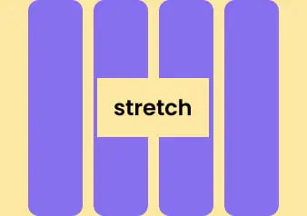
stretch (default): Items stretch to fill the space along the cross axis.
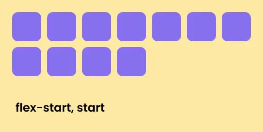
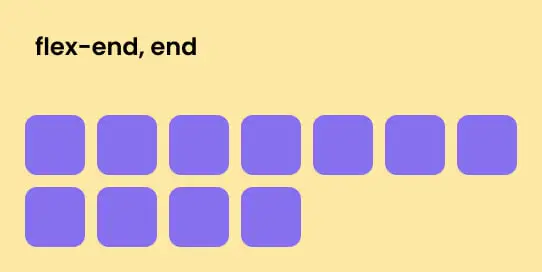
The align-content CSS property is used in a flexbox layout
to control the alignment of flex lines (rows or columns) within a flex
container when there is extra space along the cross axis (the axis perpendicular
to the direction of the main axis). This property is useful when you have
multiple lines of flex items and want to control how these lines are spaced
within the flex container.
Here are the possible values for align-content:
CSS
.container
{
align-content
:
flex-start | flex-end | center | space-between | space-around | space-evenly | stretch | start | end
;
}
flex-start: Items are placed at the top (or start) of the container.
flex-end: Items are placed at the bottom (or end) of the container.
center: Items are placed in the middle of the container.
stretch (default): Items stretch to fill the available space.
space-between: Items are spread out evenly, with the first line at the top and the last line at the bottom.
space-around: Items have equal space around them, with extra space at the edges.
space-evenly: Items are spaced out equally, including the space at the edges.
The gap property in CSS flexbox (also known as
row-gap and column-gap when used individually)
is used to set the space between flex items. This property makes it
easier to create consistent spacing without needing to use margins
on individual items.
Here’s how it works:
CSS
.container
{
display
:
flex
;
flex-wrap
:
wrap
;
gap
:
10px
;
/* sets a 10px gap between both rows and columns. */
gap
:
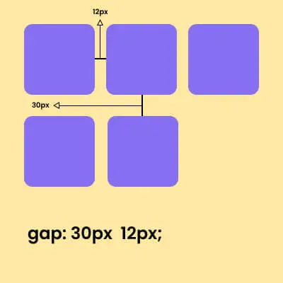
10px 24px
;
/* sets a 10px gap between rows and 24px gap between columns */
row-gap
:
10px
;
/* sets a 10px gap between rows. */
column-gap
:
10px
;
/* sets a 20px gap between columns. */
}
gap: 30px 12px;
30px vertical gap, 12px horizontal gap.
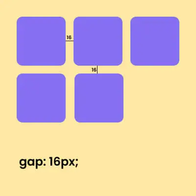
gap: 16px;
16px vertical gap, 16px horizontal gap.
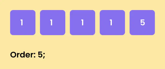
The order CSS property is used in a flexbox layout to
control the order in which individual flex items appear within a flex
container. By default, flex items are laid out in the order they appear
in the source code, but the order property allows you
to override this default behavior.
Here’s a simple example:
HTML
<
div
class
=
"
container
"
>
<
div
class
=
"
item item1
"
>
1
<
/
div
>
<
div
class
=
"
item item2
"
>
1
<
/
div
>
<
div
class
=
"
item item3
"
>
5
<
/
div
>
<
div
class
=
"
item item4
"
>
1
<
/
div
>
<
div
class
=
"
item item5
"
>
1
<
/
div
>
<
/
div
>
CSS
.container
{
display
:
flex
;
align-items
:
center
;
justify-content
:
center
;
}
.item3
{
order
:
5
;
/* default is 0 */
}
(integer) : The integer value determines the order of the flex item relative to the other flex items within the same container. The default value is 0. Negative, positive, and zero values are all allowed.
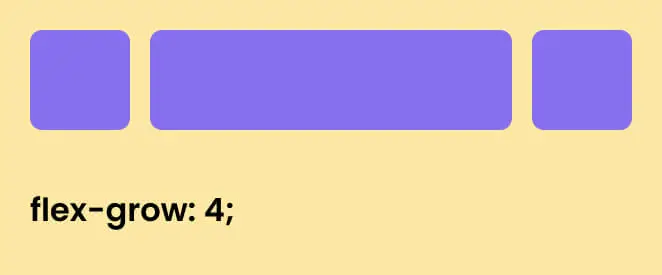
The flex-grow property in CSS flexbox is used to specify how much
a flex item should grow relative to the rest of the flex items inside a flex
container. It determines how extra space in the container should be distributed
among its children.
Here’s a simple example:
CSS
.item2
{
flex-grow
:
4
;
/* default 0 */
}
If all flex items have flex-grow set to 0 (the default), they will not grow beyond their initial size. If a flex item has a flex-grow value greater than 0, it will grow to fill the available space in the container according to the proportion defined by the flex-grow value relative to other flex items.
The flex-shrink property in CSS flexbox is used to specify how
much a flex item should shrink relative to the rest of the flex items inside
a flex container when there isn't enough space. It determines how the items
shrink to fit the container when the container is too small.
CSS
.item2
{
flex-shrink
:
3
;
/* default 1 */
}
The flex-basis property in CSS flexbox is used to specify the
initial main size (width or height depending on the main axis direction)
of a flex item before the remaining space is distributed. It defines the
initial size of a flex item along the main axis.
CSS
.item2
{
flex-basis
:
auto
;
/* default auto */
}
The flex property in CSS shorthand notation is used to
set three separate properties for flexible layout items in a flex
container: flex-grow, flex-shrink, and
flex-basis.
It's a good idea to use the shorthand `flex` property instead of setting
the individual `flex-grow`, `flex-shrink`, and `flex-basis` properties
separately. The shorthand automatically handles these values in a more
efficient and concise manner, making your CSS code cleaner and easier
to maintain.
CSS
.item2
{
flex
:
flex-grow, flex-shrink, flex-basis
;
}
The align-self CSS property is used within a flex container
to control the alignment of individual flex items along the cross axis.
It overrides the default alignment set by the container's align-items
property for the specific item.
CSS
.item2
{
align-self
:
auto | flex-start | flex-end | center | baseline | stretch
;
}

I love to hear from you! Whether you have a question, need support, or want to discuss a new project, feel free to get in touch. You can reach me via email, phone, or through our social media channels. We look forward to connecting with you!